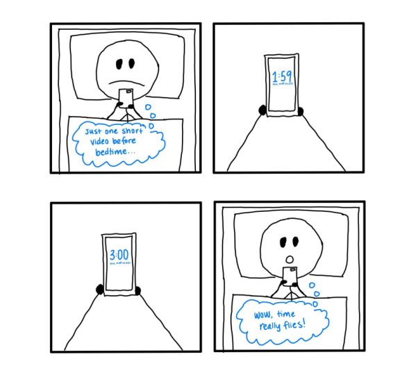
The Secret Language of Comics

Power Nap

Four-panel comic drawn by Me

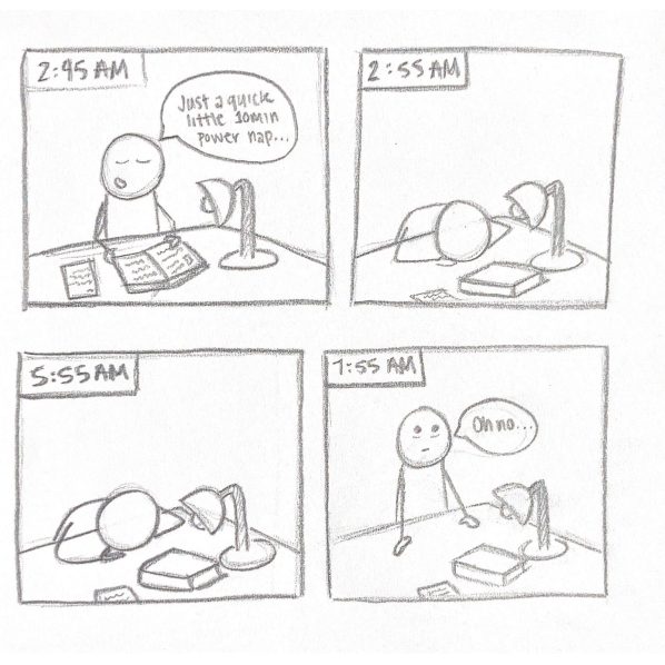
Throughout high school I would often sleep very late, staying up to finish homework and projects—sometimes pulling all-nighters. However, there was times in which I’d get really sleepy but still had something to finish so I would take quick 10 to 15-minute power naps at my desk to recharge then continue working. Unfortunately, those power naps were not always succesfully carried out. I would sleep the remainder of the night and realize it until it was time to get up and ready for school—my assignment also incomplete.

Crafting this quadriptych comic was a very fun process. At first, the idea of adding one more panel in comparison to our triptych was relieving since I struggled a bit with deciding what parts of the narrative should be presented, but at the same time now it was “I gotta think of more content to present visually from the narrative”. For inspiration, I went through some of my favorite webtoon comic Safely Endangered since the author often uses these triptych and quadriptych formats. The Safely Endangered comics are very simple and really funny; since a lot of them are based on “common” happenings, such as applying eye drops or waking up still tired, I decided to think about my personal common happenings. I sketched out two different possible panel compositions. The first two panels in my first sketch included a longer version of the dialogue in my final sketch, followed by only 1 panel of sleeping before the waking up panel. The second sketch was basically the draft of my final version: one panel with short dialogue at the beginning, followed by two panels of sleeping before waking up. I went ahead and chose the second composition because having those middle two panels stretch out helps emphasize the passage of time—which plays along ironically with my “power naps”. Compared to the triptych sketch, this felt similar in having to figure out what was most appropriate way to efficiently present my narrative. However this quadriptych was different not only since I drew it rather than base it off one photo, but also it felt like I could present a longer and more detailed narrative even though it’s only a one panel difference.

Sunday Sketch 7: Quadriptych

This quadriptych shows a person lying in bed late at night and on their phone. At 1:59 a.m. on Sunday, March 14th, 2021 (start of Daylight Savings Time), they vow to go to sleep after one more video. When they look at the time again, it is now suddenly 3:00 a.m. The person is shocked and thinks they spent all that time on their phone.

My design process for this quadriptych was similar to that of when I created my triptych. I brainstormed short stories that could be portrayed from start to end in a limited number of panels. One new observation I made was that a lot of popular memes have this same goal; they try to make a joke in one or a couple of images with little to no text. I was very inspired by all of the memes I saw today in reaction to the start of Daylight Savings Time. Every year, I see many people react in the same way, making this situation relatable and easy to understand. I don’t think it was harder than a triptych because of the extended middle panels. I specifically showed a time change because that could be easily shown with the change of the clock face across two panels. It would have been harder if there was no action or the story being told was not “dynamic” in any way.

Sketch 7: Quadriptych

You’ve made a one-panel image with your avatar, combined two images with your combophotos, and made a traditional three-panel comic like those that used to dominate the Sunday funnies sections of newspapers. This week, I’d like you to make a 4-panel comic like the ones that are currently dominating web comics.

As Peter Rubin argues in Wired, “Four-panel strips have been a fixture since early 20th-century newspaper comics like Mutt and Jeff and the concomitant appearance of yonkoma (“four-cell”) manga in Japan. It’s the perfect three-act-structure: You start at one end, develop conflict in the middle two panels, and resolve with a punch line at the end. But thanks to a number of factors—not least of which is the rise of Instagram and Reddit—a gridded, two-by-two variant has come to dominate the internet.” Notice that the four-panel comic, Rubin claims, still has a three-act structure.

You probably already know examples of such 4-panel web comics. You might check out the comics of Nathan Pyle or comics such as “Humpty Dumpty Had a Great Fall.”

WholesomeNsuchArt

Then make your own four-panel square comic. Just like with your triptych, you should still focus on telling a story with a beginning, middle, and end and you are still free to use photographs or to draw in whatever style you’d like. Focus, again, on compact, playful storytelling.

You can combine the four images into a single one or you can publish them to your post as separate images. In order to create a square in the WordPress block structure, you’ll simply need to add 2 “columns” blocks to your post and then hover over the top of each column block to add an image.

Step one: Add a Columns layout block
Step two: Add an image to each block

Column blocks are found in the “Layouts” section of the block selector. They allow you to format your blog posts with columns, to which you can add images or paragraphs of text or embed other elements and so on.

Like with your triptych, add a paragraph of text reflecting on your quadriptych comic. Describe the composition process a little bit. What was challenging about this assignment? How is crafting this sort of comic strip different or similar to the triptych? How was it different to have the middle act stretch across two panels rather than one? Why did you tell the kind of story that you did?

css.php